Making Websites Accessible For Everyone: a Guide to Inclusive Web Design
Apr 25, 2022
Published by: Jessica Day

So, you've done your pre-launch website checklist. You've proofread your content, checked your links and optimized your site for mobile devices. But is your website accessible?
Worldwide, there are around one billion people with a disability, which is about 15% of the population. For them, using the internet can be a daily struggle if companies don’t make their websites inclusive.
In 2021, only 2.6% of website homepages met all accessibility guidelines. Often, misconceptions about the difficulty and cost of inclusive design are to blame. But there are some simple changes you can make so your website is accessible to everyone. That's what we'll look at in this guide.
What does inclusive web design mean?
Inclusive web design means everyone can use websites, apps and other digital products, no matter their ability. The aim is to remove barriers for as many users as possible.
For example, take affiliate marketing. If 15% of users can't view the standard affiliate commission on your website, you're losing a lot of potential partnerships.
There are many permanent and temporary disabilities that affect how people use the web. They can be auditory, visual, cognitive, neurological, physical and tactile. They can also be environmental, such as people using a small screen or being in a noisy environment.
So, done well, inclusive web design can help all users.
Inclusive vs Accessible: What's the Difference?
Let’s say you have a daily standup meeting with your employees, but one of them hurts their back. To make the meeting accessible, you provide a chair so they can sit while everyone else stands. Great.
The meeting is accessible...but is it inclusive? No. To be inclusive, everyone should sit down. That way, your disabled employee has an equal chance to take part.
It’s the same principle with web design. If someone is partially sighted, you could make your website accessible by including a zoom option. Or you could make the font and buttons larger for everyone. That way, you've eliminated the barrier without making the person feel different. In other words, you've made your website inclusive.
What are your legal requirements?
Many countries base their accessibility legislation on the Web Content Accessibility Guidelines (WCAG). These guidelines tell you if your website is accessible to people with disabilities. There are three levels of compliance: A (basic), AA (medium) and AAA (high). The WCAG principles state web content should be.
Perceivable: All users should be able to see and read your website content.
Operable: Content should be responsive and simple to navigate.
Understandable: Interfaces should be easy to use and language should be understandable to everyone.
Robust: Websites should be compatible with a range of technology, such as screen readers.
8 ways to make your website more inclusive
1. Use simple and clear language
The language you use should be clear and simple for everyone to understand. Where possible, avoid jargon and abbreviations. If you have to use them, clearly explain them the first time you use them.
For example, if your website offers VoIP for business, you might mention a VoIP gateway. Consider the following definitions:
❌Bad: A VoIP gateway converts analog phone signals into digital data packets and transmits them over the internet.
✅Good: A VoIP gateway helps you make internet calls from a landline phone.
Simple language also helps people who speak a different language or who aren’t industry experts. Bear in mind, though, that simple shouldn’t mean patronizing.
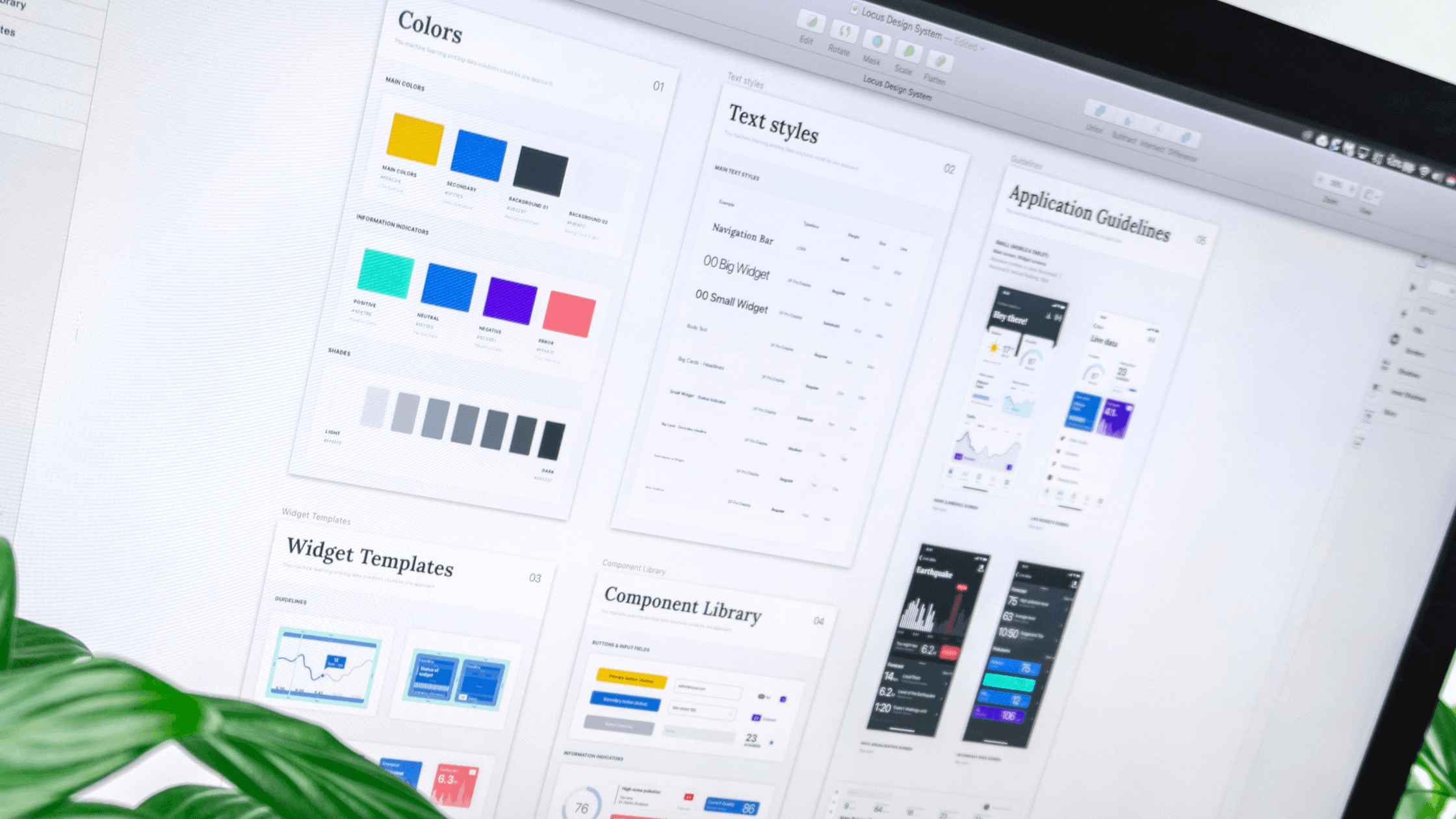
2. Use color wisely
In 2021, 86.4% of website homepages had low contrast text. That means those websites could be hard to read for visually impaired users. You should use high contrast colors that make text and graphics stand out. There are several online tools that tell you if your website meets the WCAG guidelines, such as the WCAG Color Contrast Checker.
You also need to cater for colorblind users. For instance, don’t use red and green or blue and yellow side-by-side and underline hyperlinks. You could also run your website through a color filter like Toptal to see how your site looks to colorblind users.
3. Use large buttons and font
Buttons, fonts and images should be large enough for everyone to see without zooming in. This includes people viewing your website on their mobile phones. You should check how your website looks on a range of devices. Also, make it easy for users to change the font style and size.
4. Don't overwhelm or pressure users
When it comes to inclusive web design, less is more. It’s best to use a minimalist website design that won’t overwhelm users with lots of colors or media. Alerts and animations can be distracting and confusing, so try to avoid them or let users turn them off. Never use media that flashes more than three times a second, as this can trigger an epileptic seizure.
5. Use alt text for images
Alternative (alt) text is an important but often overlooked area of accessibility. For example, in 2021, 60.6% of website homepages had missing alt text for images. Why is this a problem?
Imagine negotiating as a freelancer without being able to read the payment options. It's the same with alt text: without it, screen readers can’t describe images to their users.
When you write alt text, try to describe what’s happening in the image and how it relates to the rest of the page. You can add alt text using the <alt> attribute in an HTML image tag.
6. Use captions, transcripts and subtitles
Anything that uses audio, be it videos, podcasts or virtual receptionist services, should be accessible to everyone. That means using captions, transcripts and subtitles so people with hearing loss don’t miss out. After all, if you were watching a foreign language film, how would you know what was happening without subtitles?
7. Conduct usability testing with a range of users
It’s always good practice to run a website or app usability test before launching them. But usability tests are only valuable if you test with a range of users, including disabled users. There are six groups of disabilities you should include:
Vision: such as blindness and color blindness.
Hearing: including deafness and hearing loss.
Cognitive: such as dyslexia, autism and dementia.
Physical: like arthritis, MS and Parkinson’s.
Speech: including apraxia and stuttering.
Mental health: such as anxiety and addiction.
For the best results, you should try to test with three to five users from each group. You should also include participants with a range of assistive technologies.
8. Make forms easy to fill in and change
Finally, you need to optimize web forms so they’re easy to complete.
The simplest way you can make forms accessible is to avoid using placeholder text as labels. Placeholder text is the light gray, low-contrast text that tells you what to type in each field. It can be hard to read and remember, so always label each section separately. You should also include a short description or example of what the user should write.
It should be easy for users to change or correct forms. Show errors with symbols or by underlining them. Don’t rely on color alone. And always give users the chance to check their submission.
An inclusive world is a better world
Inclusive web design moves beyond accessibility to make websites usable for everyone.
In this guide, we outlined some simple changes you can make to help all users, not just those with disabilities. These include clear, simple language, a minimalist design and usability testing with a range of users. After all, an inclusive world is a better world, for everyone.


